
Color grading is how you give your film its unique look and mood. It involves fixing color issues through correction and then creatively adjusting contrast, saturation, and hues to match your vision. Using LUTs can quickly help you achieve various styles, while fine-tuning guarantees your footage feels cohesive and polished. Mastering these techniques allows you to craft compelling visuals that enhance storytelling. Keep exploring, and you’ll discover how to make your projects stand out.
Key Takeaways
- Understand the difference between color correction for consistency and creative color grading to set the film’s mood.
- Use LUTs to quickly apply specific visual styles, then fine-tune contrast, saturation, and hue for desired effects.
- Balance technical adjustments with artistic choices to develop a cohesive and emotionally impactful look.
- Establish a neutral baseline through correction before applying creative grades for maximum control.
- Experiment with different settings and presets to craft a unique visual style that enhances storytelling.
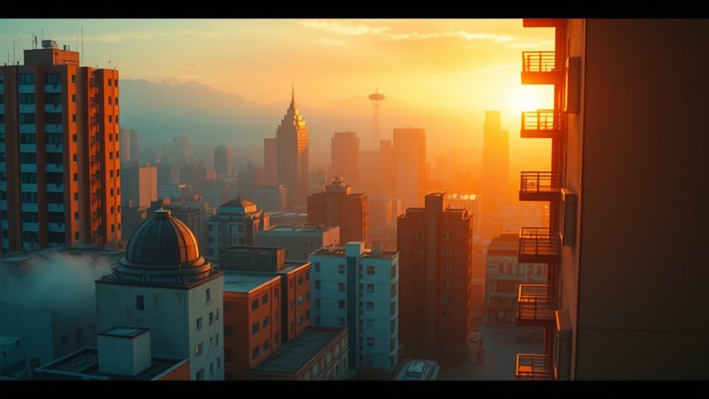
Ever wondered how filmmakers transform ordinary footage into visually stunning scenes? It all boils down to the art of color grading, a vital step that shapes the mood, atmosphere, and overall aesthetic of a film. When you delve into color grading, you start by understanding color correction, which involves fixing any color issues in your footage to guarantee consistency and accuracy. This process helps remove unwanted color casts, balance exposure, and establish a neutral baseline so that your footage looks natural and cohesive. Once you’ve completed color correction, you can move on to creative adjustments to give your film its unique look.
One of the most efficient tools in your color grading arsenal is LUT application—Lookup Tables. LUTs are preset color profiles that instantly transform the look of your footage by applying specific color grades with a single click. Think of LUTs as filters for professional video; they can emulate the warm tones of a sunrise, the cool hues of a moody scene, or the desaturated feel of a gritty documentary. Applying a LUT is straightforward: you import it into your editing software and overlay it onto your footage. This process saves you time and provides a consistent style across multiple shots, especially useful for maintaining visual harmony in scenes shot under different lighting conditions. Additionally, understanding color correction is essential for achieving a professional-grade look in your films.
While LUTs give you a quick starting point, don’t rely solely on them. After applying a LUT, you’ll want to fine-tune the settings to match your creative vision. Adjust the contrast, saturation, and hue as needed to make the image pop or to evoke a specific emotion. Remember, color correction ensures your footage is technically sound, while LUT application and subsequent tweaks help craft the artistic look that tells your story. Combining these techniques allows you to elevate your project from simple footage to a polished visual experience.
Understanding the importance of color correction and LUT application empowers you to manipulate color intentionally. Whether you’re aiming for a cinematic, nostalgic, or futuristic vibe, these tools give you control over how your audience perceives each scene. As you become more comfortable with these processes, you’ll start experimenting more boldly—trying different LUTs, customizing their settings, or even creating your own. This experimentation helps develop your unique style and enhances your ability to communicate mood and tone visually. Ultimately, mastering color correction and LUT application forms the foundation for compelling, professional-looking films that leave a lasting impression.
Frequently Asked Questions
How Does Color Grading Influence Audience Emotions?
Color grading influences your audience’s emotional response and viewer engagement by setting the mood and tone of a scene. Bright, vibrant colors can evoke happiness or excitement, while darker, muted tones create tension or sadness. You guide your viewers’ feelings subtly, making scenes more immersive. By carefully adjusting colors, you help shape their experience, ensuring they connect emotionally and stay engaged throughout the story.
What Are Common Software Tools Used in Professional Color Grading?
You use professional color grading software like DaVinci Resolve, Adobe Premiere Pro, or Baselight to achieve stunning visuals. These professional tools offer advanced features such as color wheels, curves, and masks, giving you precise control over the film’s look. They help you enhance mood, correct colors, and create a cohesive aesthetic, ensuring your project stands out. Mastering these tools can elevate your filmmaking and deliver a polished final product.
How Does Color Grading Differ From Color Correction?
You’ll find that color grading vs correction serve different purposes. Color correction focuses on fixing technical issues like exposure, white balance, and color accuracy to make the footage look natural. Color grading, however, involves creatively adjusting colors to craft a specific mood or style. The technical differences lie in their goals: correction guarantees a neutral baseline, while grading enhances the visual storytelling through deliberate color choices.
Can Color Grading Be Automated or Is It Always Manual?
Ever wondered if color grading can be fully automated? While automated workflows now assist with initial looks, you still need to make manual adjustments for perfection. Automation speeds up the process and handles repetitive tasks, but it can’t replicate your artistic vision and nuanced decisions. So, yes, some parts are automated, but the best results come from balancing automation with your creative input and manual tweaks.
How Do You Choose a Color Palette for a Specific Genre?
When choosing a color palette for a specific genre, you should focus on genre-specific tones that evoke the right mood. Think about the emotional impact you want—dark, muted colors for horror or vibrant, lively tones for comedy. Use color palette selection to align with these tones, ensuring your visuals support the story’s atmosphere. Trust your instincts, and don’t be afraid to experiment until the palette feels right for your genre.
Conclusion
Now that you know the basics of color grading, you’re equipped to give your films a stunning, professional look. Remember, even the smallest color tweaks can transform your footage from ordinary to breathtaking — like turning a plain canvas into a masterpiece. Don’t be afraid to experiment and trust your eye; after all, mastering color grading can open a whole new level of storytelling magic. Keep practicing, and soon you’ll create visuals that leave viewers utterly mesmerized.