
Choosing between 4K, 1440p, and 1080p for work depends on your need for clarity and hardware capacity. 4K offers crisp, detailed text but demands a powerful graphics card, potentially causing latency issues. 1440p strikes a good balance with sharp visuals and smoother performance, while 1080p is easier on hardware but less sharp. If you want to discover which resolution truly enhances your workspace, keep exploring the details ahead.
Key Takeaways
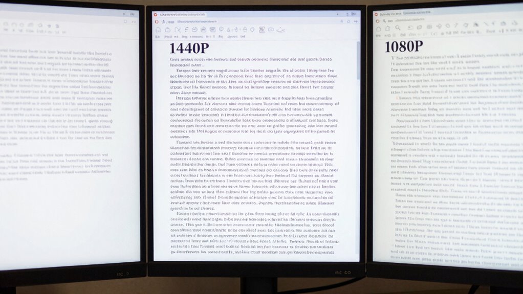
- 1080p offers decent text clarity for most work tasks, especially on smaller screens or with standard viewing distances.
- 1440p provides sharper text than 1080p, improving readability without heavily taxing hardware.
- 4K delivers the best text clarity, but may introduce scaling issues that affect readability on some displays.
- Hardware limitations can impact perceived text sharpness and responsiveness across all resolutions.
- The “winner” in text clarity depends on display size, scaling settings, and hardware, not just resolution alone.
Choosing the right screen resolution can substantially impact your productivity and comfort during work. When evaluating options like 4K, 1440p, and 1080p, it’s essential to consider how each affects your ability to see details clearly and work efficiently. While higher resolutions promise sharper images, they also come with trade-offs, especially in color accuracy and latency performance, which can influence your overall experience.
At 4K, you’ll enjoy stunning clarity and incredibly detailed visuals. This resolution is ideal if your work involves precise image editing, graphic design, or any task where visual detail is paramount. However, the increased pixel count demands more from your graphics card, potentially leading to higher latency, especially if your hardware isn’t top-tier. Latency performance becomes critical here; a delay between your input and the display can hinder productivity, particularly during tasks requiring fast cursor movement or real-time adjustments. Additionally, 4K screens often excel in color accuracy, allowing you to see more vibrant and true-to-life colors, which is vital for professional work involving color grading or detailed visual assessments.
4K displays offer stunning clarity and color accuracy but demand powerful hardware to minimize latency during detailed work.
Switching to 1440p offers a middle ground. It strikes a balance between resolution and performance, providing sharper images than 1080p but not as demanding as 4K. You’ll notice improved clarity and a more comfortable workspace without putting excessive strain on your system. This resolution tends to have lower latency, making interactions smoother and more responsive, which benefits multitasking and quick edits. Color accuracy at 1440p is generally reliable enough for most professional tasks, though it might not match the depth and vibrancy of a 4K display. If you’re looking for a resolution that enhances your work experience without sacrificing performance, 1440p is often the best compromise.
Finally, 1080p remains a solid choice for many users, especially if your hardware isn’t geared towards high-end performance or if your work primarily involves text, spreadsheets, or basic design. It offers lower latency, meaning your inputs are reflected almost instantly, which can boost efficiency during rapid tasks. While the image isn’t as crisp as higher resolutions, 1080p still provides decent color accuracy for most professional applications, ensuring your work looks clear and vibrant without the need for extensive hardware upgrades. Overall, if you prioritize fluidity and responsiveness, 1080p might be your best option, even if the text and images aren’t as sharp. Additionally, advancements in display technology continue to improve the quality and affordability of lower-resolution screens, making them suitable for a wider range of professional needs.

Dell 27 Plus 4K Monitor – S2725QS – 27-inch 4K (3840 x 2160) 120Hz 16:9 Display, IPS Panel, AMD FreeSync Premium, sRGB 99%, Integrated Speakers, 1500:1 Contrast Ratio, Comfortview – Ash White
Improved ComfortView Plus: Reduces harmful blue light emissions to ≤35%, for all-day comfort without sacrificing color accuracy.
As an affiliate, we earn on qualifying purchases.
As an affiliate, we earn on qualifying purchases.
Frequently Asked Questions
How Does Screen Size Affect Clarity at Each Resolution?
Your screen size considerably impacts clarity at each resolution. Larger screens require you to sit farther away to maintain sharpness, especially at lower resolutions like 1080p. Smaller screens can offer clearer text at closer viewing distances, even at 1440p or 4K. To optimize clarity, match your screen size with your usual viewing distance, ensuring text remains crisp without straining your eyes.
Which Resolution Is Best for Color Accuracy in Professional Work?
You should choose a 4K display for the best color accuracy in professional work. It offers superior color calibration and display uniformity, ensuring consistent, precise colors across the screen. Higher resolution screens like 4K also allow for better detail and finer adjustments during calibration, reducing color shifts. This makes 4K ideal for tasks demanding accurate color representation, such as photo editing, graphic design, and video production.
Do Higher Resolutions Impact System Performance or Battery Life?
Higher resolutions can impact system performance and battery life because they increase power consumption and demand more from your hardware. When you use 4K displays, your graphics card works harder, and your device consumes more energy, leading to shorter battery life. If your hardware isn’t optimized for high resolutions, you might experience lag or reduced performance. So, consider your hardware requirements before opting for higher resolutions for work.
Are There Specific Tasks Where 1080P Is Preferable Over Higher Resolutions?
Surprisingly, 1080p is still your best bet for tasks needing precise color calibration and font rendering, like photo editing or detailed design work. Ironically, higher resolutions can sometimes make small text harder to read, despite sharper images. If your focus is on accuracy and clarity in fonts, sticking with 1080p guarantees you don’t sacrifice readability or color fidelity, especially on smaller screens.
How Does Pixel Density Influence Perceived Text Sharpness?
Pixel density directly impacts perceived sharpness, especially for text. When your screen has a higher pixel density, individual pixels become smaller and less noticeable, making text appear crisper and more detailed. Conversely, lower pixel density can cause text to look slightly blurred or pixelated. So, increasing pixel density enhances perceived sharpness, helping you read comfortably and clearly, especially on high-resolution screens like 4K displays.

Samsung 27" Odyssey G5 (G51F) Gaming Monitor – QHD (1440P), 180Hz, 1ms, AMD FreeSync, HDR10, Height Adjustable Stand, Black Equalizer, Virtual Aim Point, Auto Source Switch+, LS27FG512ENXZA
QHD Resolution (2560 x 1440) has 1.7 times the pixel density of Full HD for incredibly detailed pinsharp…
As an affiliate, we earn on qualifying purchases.
As an affiliate, we earn on qualifying purchases.
Conclusion
Choosing between 4K, 1440p, and 1080p isn’t just about pixels; it’s about how clearly you see the path ahead. Each resolution is a stepping stone, guiding your work journey with different clarity levels. Remember, the true focus isn’t the screen’s resolution but your ability to navigate your tasks with precision. Like a lighthouse illuminating the way, select the resolution that best helps you find clarity and confidence in your work voyage.

acer KB220Q H2bi 21.5" Full HD (1920 x 1080) Zero-Frame Home Office Monitor | Adaptive-Sync Support (FreeSync Compatible) | Up to 100Hz Refresh | 1ms (VRB) | sRGB 99% | Tilt | HDMI & VGA Ports
Vibrant Images: Crisp, true-to-life colors come alive in Full HD 1080p resolution. Movies and games appear more real…
As an affiliate, we earn on qualifying purchases.
As an affiliate, we earn on qualifying purchases.

Raywego 32-Inch 4K Gaming Computer Monitor 60Hz UHD 3840×2160, 99% sRGB, HDR10, FreeSync, Low Input Lag, Billions of Colors, Frameless Design, HDMI/DP VESA Eye-Care for Gaming Graphic Design
4K UHD 3840×2160 – Sharper Than 2K or 1080P : Experience true 4K UHD 3840×2160 resolution on this…
As an affiliate, we earn on qualifying purchases.
As an affiliate, we earn on qualifying purchases.